Brand Option 02
Chapman is a contemporary display serif with extended proportions — wider letterforms, sharper terminals, and a more architectural rhythm than Corundum. It pushes Liberty Strategic Minerals into modern editorial territory, with a circular seal that wraps the full name around a centred L.
Brand Identity
Positioning, tone, and the strategic territory the brand occupies.
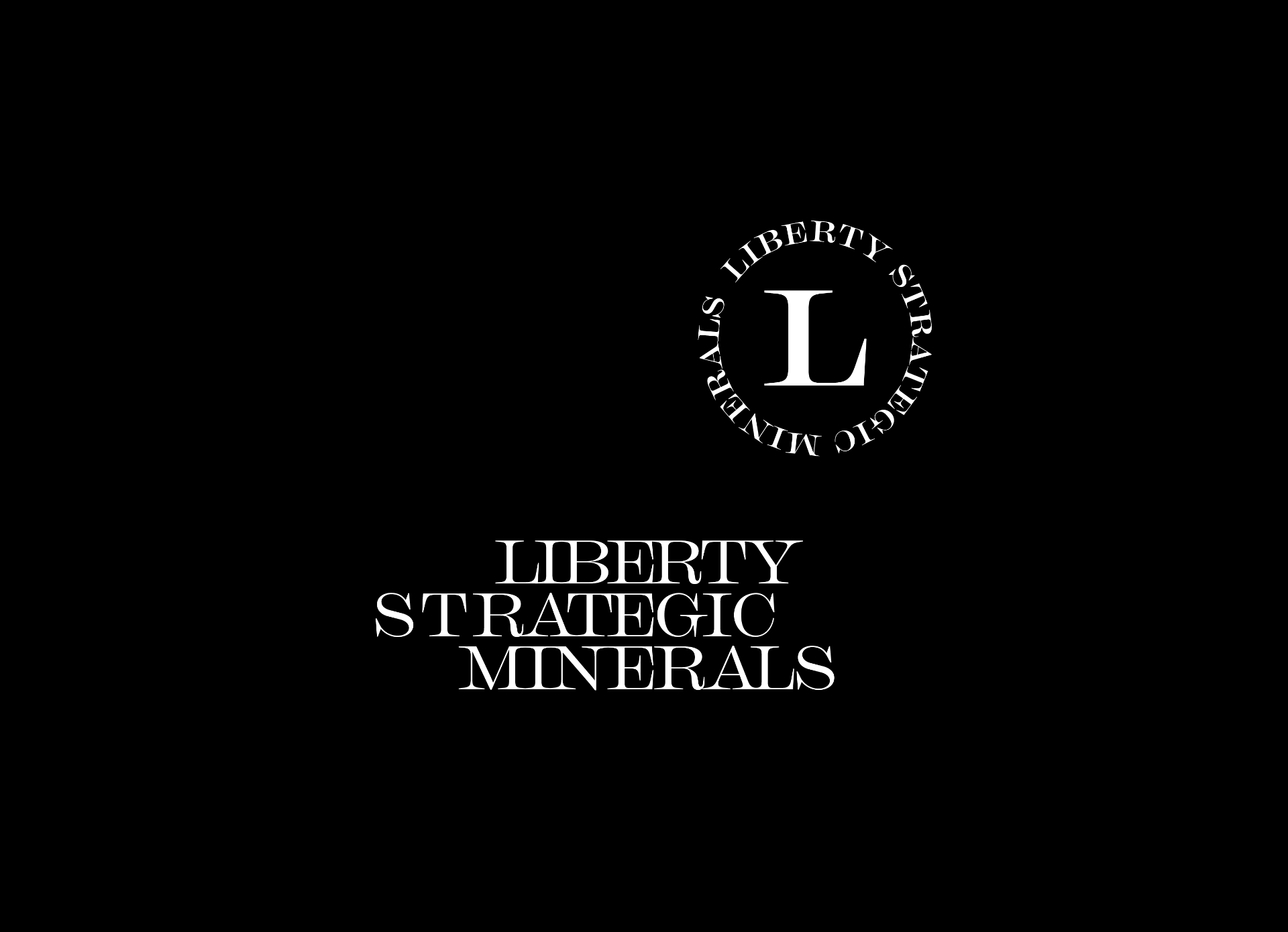
The primary stack pairs the circular Chapman seal with the full name set in three deliberate lines. The wider proportions of Chapman give the lockup an editorial, almost masthead quality.
Notes — Brand Identity
SyncedComment on brand identity for Brand Option 02. Notes sync live to the team.
Loading notes…
Logos
Primary mark, secondary lockups, and clear-space rules.
The seal carries the full name around a centred L; the horizontal wordmark is the working lockup for documents and signatures.
Notes — Logos
SyncedComment on logos for Brand Option 02. Notes sync live to the team.
Loading notes…
Colourways
Core palette, supporting colours, and contrast pairings.
Four tones: onyx, graphite, ash, and ember. Ember is the accent.
Notes — Colourways
SyncedComment on colourways for Brand Option 02. Notes sync live to the team.
Loading notes…
Image Application
Example of application of imagery and the logo/brandmark.
Example of application of imagery and the logo/brandmark.
Notes — Image Application
SyncedComment on image application for Brand Option 02. Notes sync live to the team.
Loading notes…
Real-Life Mock-ups
Identity applied across stationery, signage, and physical environments.
The Chapman identity applied to the full stationery suite.
Notes — Real-Life Mock-ups
SyncedComment on real-life mock-ups for Brand Option 02. Notes sync live to the team.
Loading notes…
Web Page Mock-up
Digital expression of the brand across the homepage and key surfaces.
Example of typeface effect.
Notes — Web Page Mock-up
SyncedComment on web page mock-up for Brand Option 02. Notes sync live to the team.
Loading notes…